Hello world! I’m starting off 2018 by finally getting a data science blog up and running!
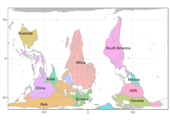
Since this is a “Hello World” post, let’s create a map of the world in R. I’m watching The West Wing while writing this, so let’s see if we can create the map from this classic episode.
HUGOMORE42Basic World Map
We’ll start by creating a basic map of the countries of the world using ggplot2. This guide provided a nice primer to the steps required. We’ll use the map_data() function to produce a data frame suitable to feed in to ggplot().
library(tidyverse)
world_data <- map_data("world")

world_data %>%
  ggplot(aes(long, lat, group = group)) +
  geom_polygon(fill = "white", color = "gray") -> base_map

base_map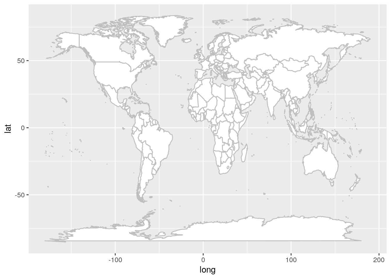
In the West Wing episode, the Cartogrophers for Social Equality advocate for use of the Peter’s projection. We use coord_map() to apply specific map projections available to the mapproject() function. Unfortunately Peter’s doesn’t appear in this list. A Google search revealed that this projection is more commonly referred to as the Gall-Peters projection. I got excited when I saw mapproject() has "gall" as one of the available projection. However, this didn’t look right..
base_map +
  coord_map("gall", lat0 = 15)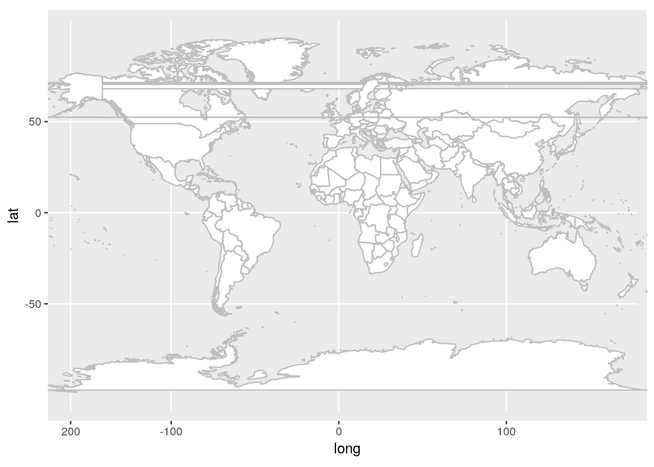
After diving in to a deeper read of the Wikipedia article and reading the mapproject() documentation more carefully revealed that the "gall" refers to one of Gall’s other projections. The mapproject() documention indicates that "gall" is a stereographic projection, but Gall-Peters is a cylindric equal-area projection with the standard paralles at 45°. Therefore, we’ll use the "cylequalarea" projection and set lat0 = 45
base_map +
  coord_map("cylequalarea", lat0 = 45)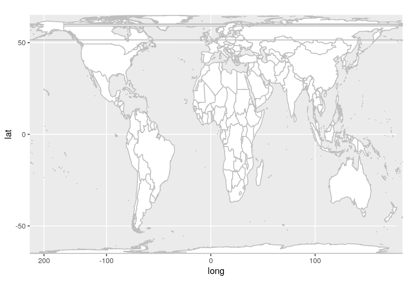
This is looking better, however we seem to have some rendering issues causing lines through Russia and Canada. More Googling brought me to this blog post indicating that it’s a long standing ggplot2 issue. Reading the issue comments indicates that setting an xlim in the coord_map() is a quick and dirty fix.
base_map +
  coord_map("cylequalarea", lat0 = 45, xlim = c(-180, 180))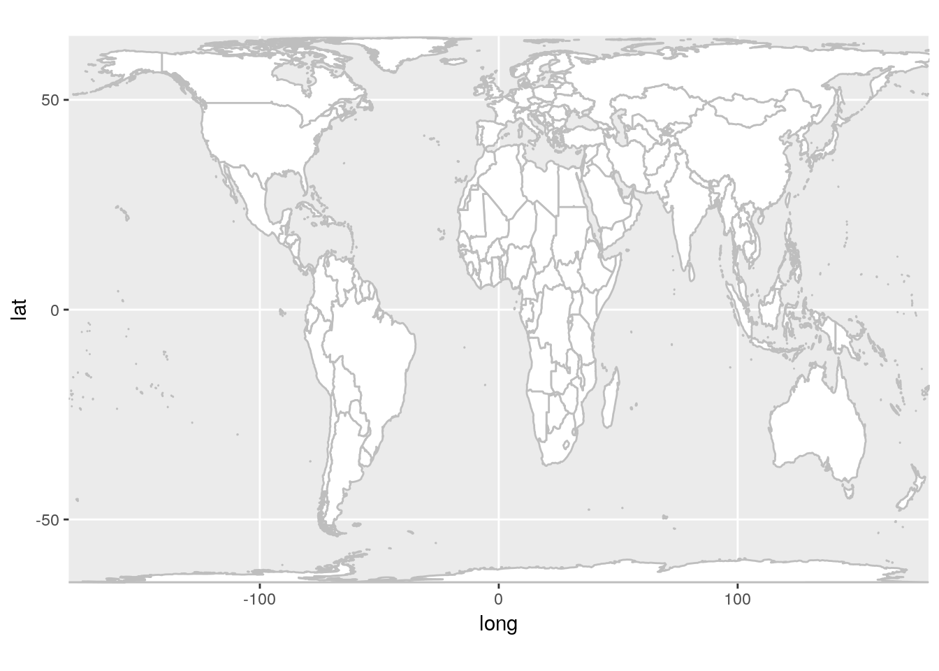
That worked pretty well.
Coloring
The map in West Wing episode is color coded in a very unique way. It’s sort of by continent, but the USA, Canada, Mexico, China, and India are carved out for some reason. The map_data() function provides country names as the region variable. We should be able to translate the country names to contients and then customize from there.
While searching for a data set that might provide these translations, I ran across the countrycode package. This package has a function to convert country names and codings.
library(countrycode)
world_data %>%
  mutate(custom_group = countrycode(region, "country.name", "continent")) -> world_data_group

world_data_group %>%
  ggplot(aes(long, lat, group = group, fill = custom_group)) +
  geom_polygon(color = "gray") +
  coord_map("cylequalarea", lat0 = 45, xlim = c(-180, 180))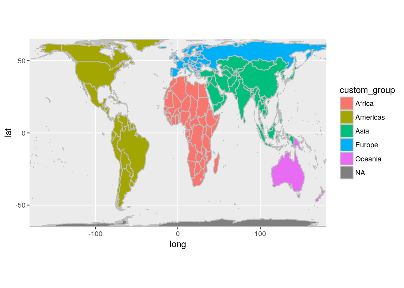
This looks like we’ll have to do too much manual dividing to get our custom groupings. The map in West Wing appears to separate out Southeast Asia and I don’t want to have to lookup every country in that group. The "region" coding schemes in countrycode() groups by the World Bank Development Indicators and ends up as a better starting point.
world_data %>%
  mutate(custom_group = countrycode(region, "country.name", "region")) -> world_data_group

world_data_group %>%
  ggplot(aes(long, lat, group = group, fill = custom_group)) +
  geom_polygon(color = "gray") +
  coord_map("cylequalarea", lat0 = 45, xlim = c(-180, 180))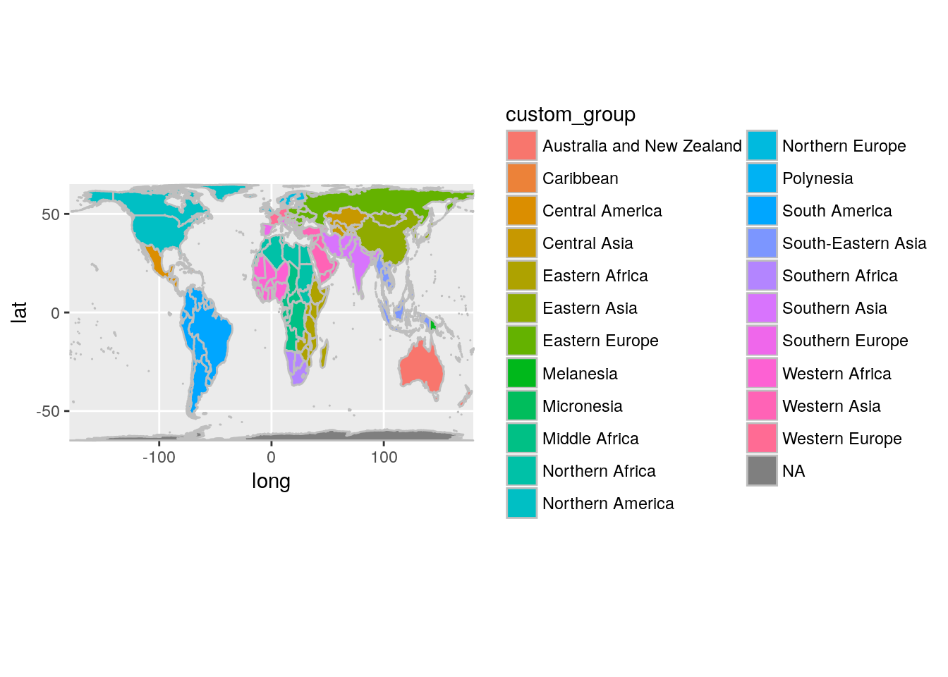
This is more divided than we need, but we can use some grepl() magic to combine the African and Southeast regions the way we want them. We’ll also pass along the country name for those that are singled out in our West Wing map.
world_data_group <- world_data %>%
  mutate(custom_group = countrycode(region, "country.name", "region")) %>%
  mutate(custom_group = case_when(region == "USA" ~ region,
                                  region == "Mexico" ~ region,
                                  region == "Russia" ~ "Asia",
                                  region == "Canada" ~ region,
                                  region == "Saudi Arabia" ~ region,
                                  region == "China" ~ "SE_Asia",
                                  region == "India" ~ region,
                                  custom_group == "Australia and New Zealand" ~ "Austraila",
                                  custom_group %in% c("Caribbean",
                                                      "Central America") ~ "South America",
                                  custom_group %in% c("Southern Asia",
                                                      "Central Asia",
                                                      "Western Asia") ~ "Asia",
                                  grepl("Asia", custom_group) | custom_group == "Melanesia" ~ "SE_Asia",
                                  grepl("Africa", custom_group) | custom_group == "Micronesia" ~ "Africa",
                                  grepl("Europe", custom_group) ~ "Europe",
                                  TRUE ~ custom_group))

world_data_group %>%
  ggplot(aes(long, lat, group = group, fill = custom_group)) +
  geom_polygon(color = "gray") +
  coord_map("cylequalarea", lat0 = 45, xlim = c(-180, 180))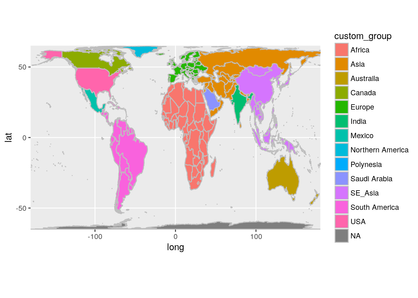
Labels
Now let’s add the labels similar to those in our episode’s map. We’ll need to find the middle of each group to be able to place our labels nicely. I’m sure there are more accurate geospatial methods, but for this purpose I’ll just take the mean of all the longitude and latitude points.
world_labels <- world_data_group %>%
  group_by(custom_group) %>%
  summarise(long = mean(long), lat = mean(lat), group = group[1])

world_data_group %>%
  ggplot(aes(long, lat, group = group, fill = custom_group)) +
  geom_polygon(color = "gray", alpha = .5) +
  coord_map("cylequalarea", lat0 = 45, xlim = c(-180, 180)) +
  geom_text(data = world_labels, aes(label = custom_group)) +
  guides(fill = FALSE)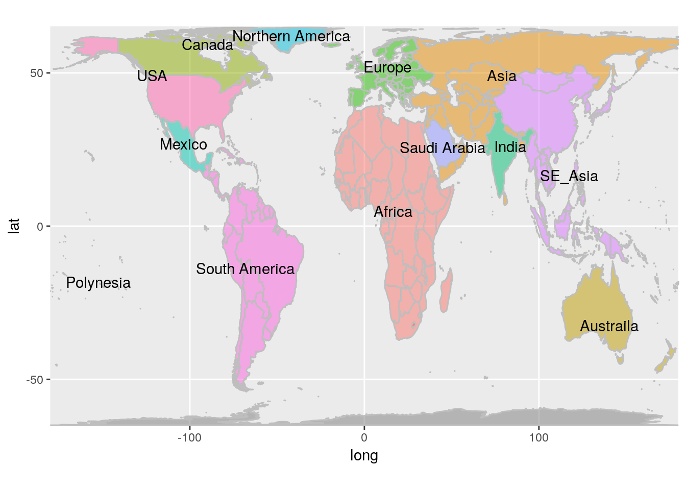
This is pretty good, but we’ve got more data labels than we need. The episode map also labels Asia in the middle of Russia and labels China instead of Southeast Asia. We’ll add a custom_label variable to make these adjustments. We’ll also do some manual adjustments to better position the USA and Canada labels.
world_labels <- world_data_group %>%
  mutate(custom_label = case_when(region == "Russia" ~ "Asia",
                                  region == "China" ~ "China",
                                  custom_group %in% c("SE_Asia", "Asia", "Saudi Arabia", "Polynesia",
                                                      "Northern America") ~ "",
                                  TRUE ~ custom_group)) %>%
  filter(custom_label != "") %>%
  group_by(custom_label) %>%
  summarise(long = mean(long), lat = mean(lat), group = group[1], custom_group = custom_group[1]) %>%
  mutate(long = ifelse(custom_label == "USA", long + 20, long),
         lat = ifelse(custom_label == "USA", lat - 10, lat)) %>%
  mutate(long = ifelse(custom_label == "Canada", long - 20, long),
         lat = ifelse(custom_label == "Canada", lat - 10, lat))


world_data_group %>%
  ggplot(aes(long, lat, group = group, fill = custom_group)) +
  geom_polygon(color = "gray", alpha = .5) +
  coord_map("cylequalarea", lat0 = 45, xlim = c(-180, 180)) +
  geom_text(data = world_labels, aes(label = custom_label)) +
  guides(fill = FALSE)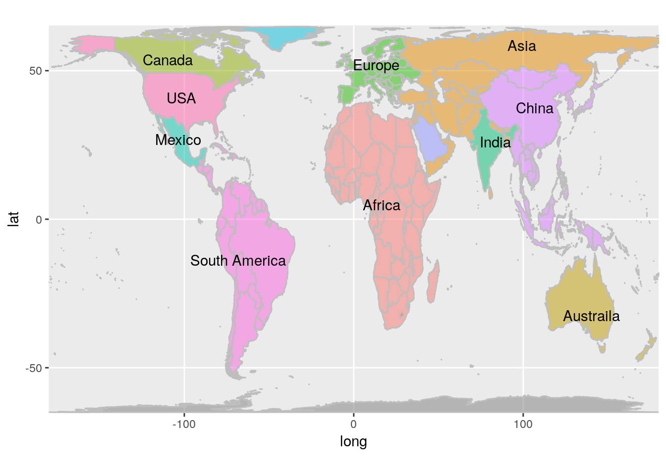
Finally, let’s turn the world upside down!
world_data_group %>%
  ggplot(aes(-long, -lat, group = group, fill = custom_group)) +
  geom_polygon(color = "gray", alpha = .5) +
  coord_map("cylequalarea", lat0 = 45, xlim = c(-180, 180)) +
  geom_text(data = world_labels, aes(label = custom_label)) +
  guides(fill = FALSE) +
  labs(title = "Reverse Pole Peters Projection Map",
       x = NULL,
       y = NULL) +
  theme_bw()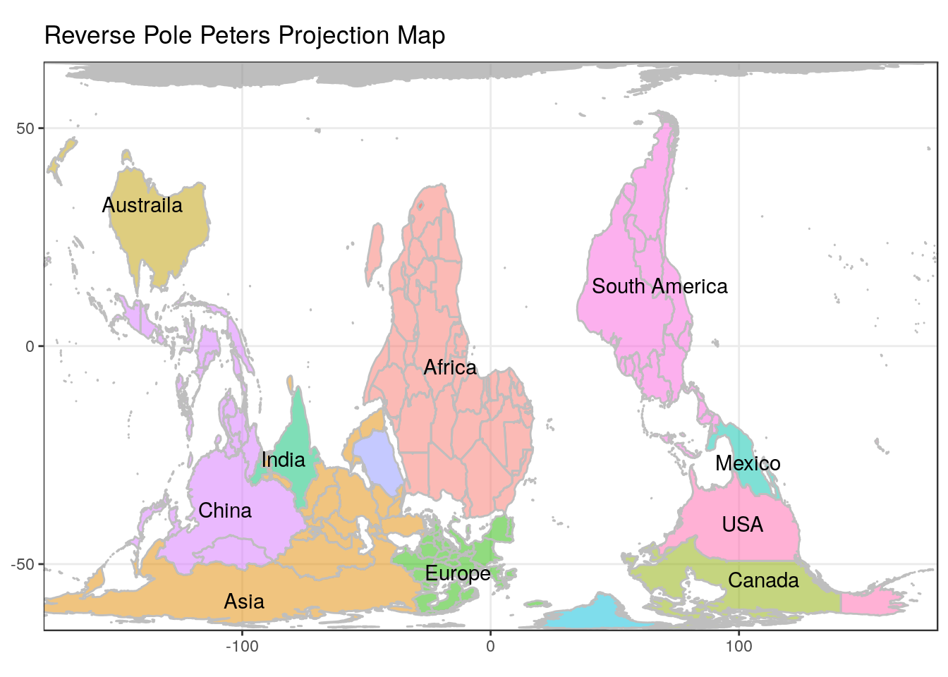
What I Learned
While trying to build this map I learned how to create a basic map using ggplot2 and how to work around rendering issues by setting the xlim parameter. I discovered the countrycode package, which should come in handy in the future. And, I had to learn more than I thought I would need to about map projections.
Questions, critiques, and feedback are welcome in the comments section below. My thanks in advance to anyone that takes the time to leave one.
